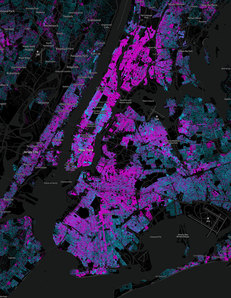
Data Scientist Ryan McCullough recently used census data and other sources to create this great interactive map of New York City showing where people rent, and where people own their own apartments or homes. It should come as no surprise that with our home costs, our City is mostly purple (renters).
This is a map showing every single person in the United States as a dot. Data is taken from the 2010 US Census, and is accurate at the level of a block, however within each block location is randomized. Points are colored based on the percentage of home owners versus renters on a block, to show larger geographical structures of home ownership.
Check out the full map to play around with the data for NYC or other cities across the nation.
h/t 6sqft

Matt Coneybeare
Editor in Chief
Matt enjoys exploring the City's with his partner and son. He is an avid marathon runner, and spends most of his time eating, running, and working on cool stuff.
Something wrong with this post? Let us know!


