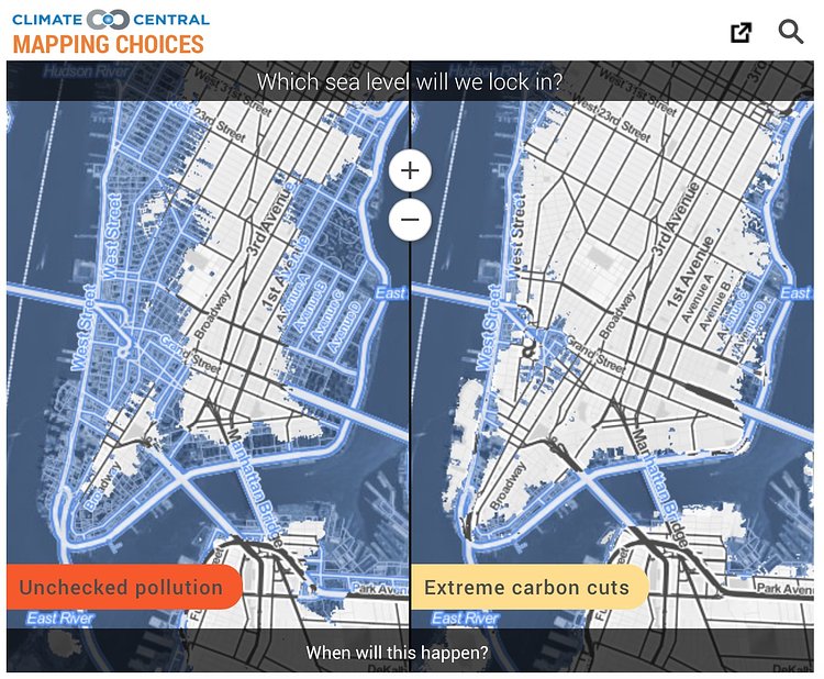
A new interactive map from Climate Central show a side by side comparison of what our City will look like with unchecked carbon emissions, and a severe reduction and extreme carbon cuts. Both maps show a rising sea level, with one obviously worse than the other.
[The maps] do not show what sea levels will be in this century […] What they do show are scientific projections, taken from this paper, of the different post-2100 sea levels that could lock in this century, depending upon the carbon pathway we select. The areas colored blue are the areas below those levels -- areas which will eventually be permanently underwater. These maps pose this question: which legacy will we choose?
Check out the larger interactive map to see how your neighborhood will fare in the coming centuries.
via Gothamist

Matt Coneybeare
Editor in Chief
Matt enjoys exploring the City's with his partner and son. He is an avid marathon runner, and spends most of his time eating, running, and working on cool stuff.
Something wrong with this post? Let us know!


