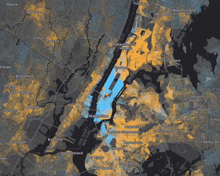
As part of a larger article on income inequality in major metropolitan cities across the United States titled Wealth Divides, this interesting interactive map appears showing how that divide affects New York City boroughs. On this map, each blue dot represents an annual income of over $150,000, whereas orange dots represent those making less than that per year. As you would expect, almost all of the City's wealthiest people live in Manhattan. Check out the accompanying article to play around with this map and other data visualizations showing income inequality in the City.
via ESRI

Matt Coneybeare
Editor in Chief
Matt enjoys exploring the City's with his partner and son. He is an avid marathon runner, and spends most of his time eating, running, and working on cool stuff.
Something wrong with this post? Let us know!


