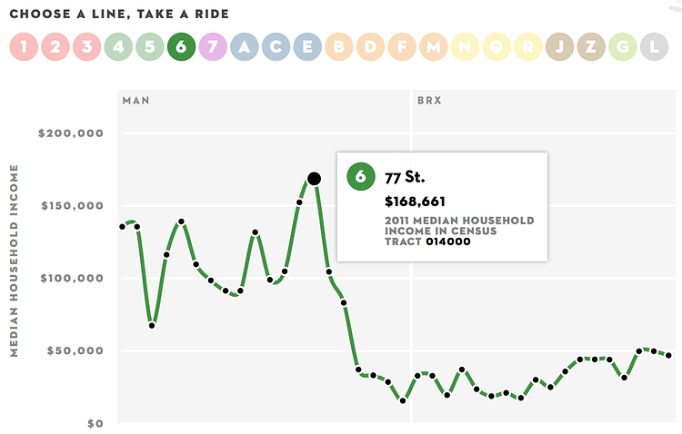
Inequality and New York's Subway is an interactive project from The New Yorker that plots out the median income levels, using U.S. Census Bureau data, of the areas surrounding each subway stop, along a line of the subway itself. The resulting graph shows how the income levels change as you progress through the stops on any subway line. While the accompanying article is from 2013, and the City's income inequality has exacerbated in the years since, it is still a pretty accurate representation of the income inequality across the subway lines.
New York City has a problem with income inequality. And it’s getting worse—the top of the spectrum is gaining and the bottom is losing. Along individual subway lines, earnings range from poverty to considerable wealth. The interactive infographic here charts these shifts, using data on median household income, from the U.S. Census Bureau, for census tracts with subway stations.
via The New Yorker

Matt Coneybeare
Editor in Chief
Matt enjoys exploring the City's with his partner and son. He is an avid marathon runner, and spends most of his time eating, running, and working on cool stuff.
Something wrong with this post? Let us know!


