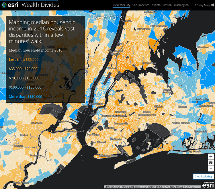
Mapping company ESRI recently created this great interactive "story map" that sheds light on income inequality across the United States. Of course, New York City has some of the highest levels of income inequality in the country, so we are featured heavily in the report. This image, for instance, shows the levels of income inequality per zip code using the most recent census data.
Most of New York City's wealthiest residents live in Manhattan, where income disparity is heightened by high densities – and high-rises. Several super-tall condominium buildings have been built in recent years, with apartment prices topping out at or near a quarter-billion dollars.
Scroll through the full Wealth Divides story map to learn more.
via ESRI

Matt Coneybeare
Editor in Chief
Matt enjoys exploring the City's with his partner and son. He is an avid marathon runner, and spends most of his time eating, running, and working on cool stuff.
Something wrong with this post? Let us know!


