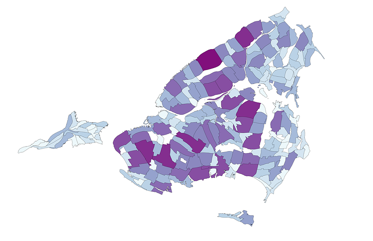
A cartogram is a special type of map in which the geographic boundaries of a region are redrawn to display the distribution of a certain feature within that geography. This cartograph, created by Tableau support analyst Nicholas Hara, shows the neighborhoods of New York City resized to convey population density. A neighborhood is presented larger if it is more dense than the average, and smaller if it is less dense.
What the heck is up with Manhattan? Too much time at the Shake Shack? And why does Staten Island look like a deflated balloon? [&hellip]; In this picture we see the 5 Burroughs [sic] of New York, divided into their separate neighborhoods, and sized by population. New York City's normal geographic boundaries have their area resized to match their relative populations. I have also colored the neighborhoods to further show the largest neighborhoods by population.
Check out the accompanying article on Hara's blog For Public Eyes Only for more insight an analysis into this map, and others.

Matt Coneybeare
Editor in Chief
Matt enjoys exploring the City's with his partner and son. He is an avid marathon runner, and spends most of his time eating, running, and working on cool stuff.
Something wrong with this post? Let us know!


