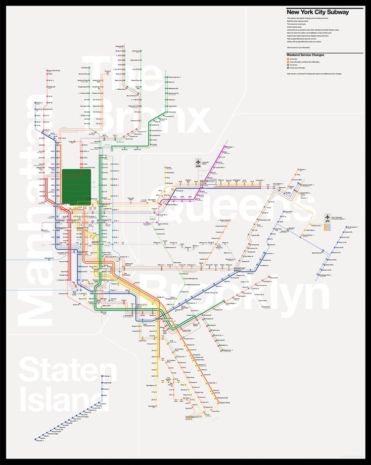
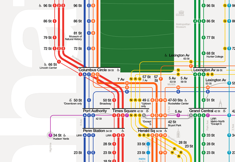
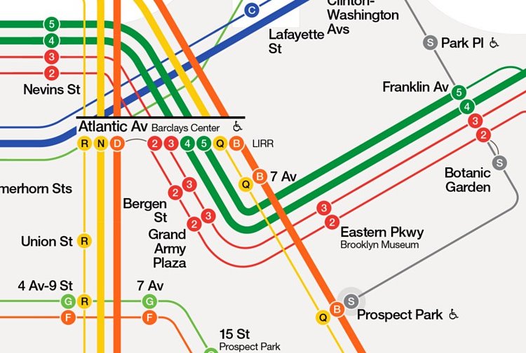
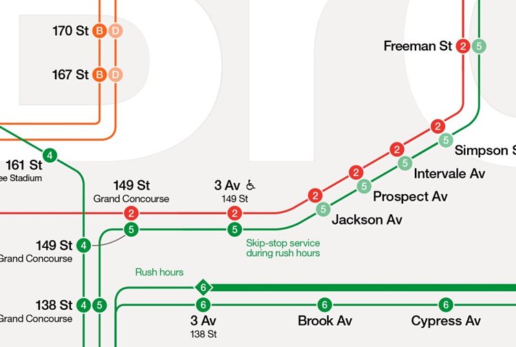


You may know the subway map like the back of your hand, but for subway-newbs and tourists, it can be quite a confusing document to parse. Not only is the map difficult to read, but it has very few visual consistencies with the physical signage in the stations.
Finnish designer Tommi Moilanen thought he could design a new map that was easier to read, beautiful, and ties in with the iconic Helvetica signage in the stations.
The goal was to create a subway map that is beautiful to look at, easy to use and custom designed for New York City.
Check out the designer's detailed post on Medium where he explains most of his design decisions behind the layout and structure of the new map.

Matt Coneybeare
Editor in Chief
Matt enjoys exploring the City's with his partner and son. He is an avid marathon runner, and spends most of his time eating, running, and working on cool stuff.
Something wrong with this post? Let us know!


