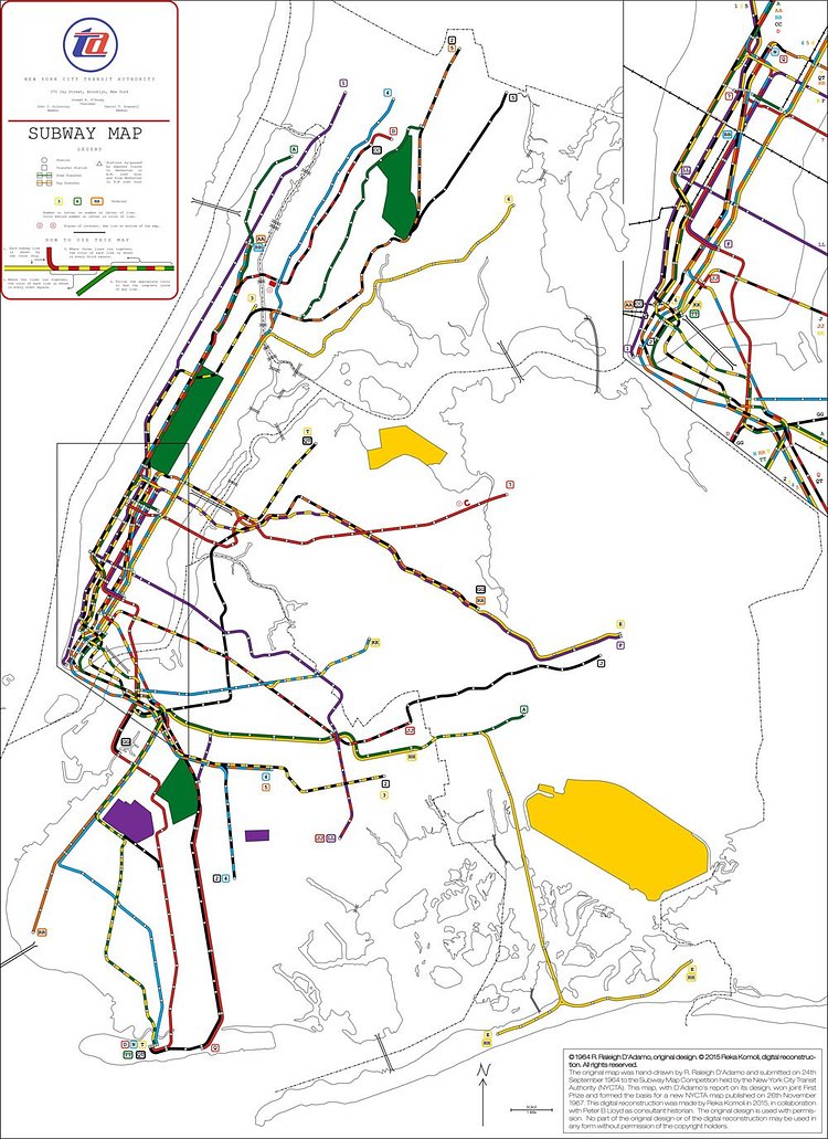
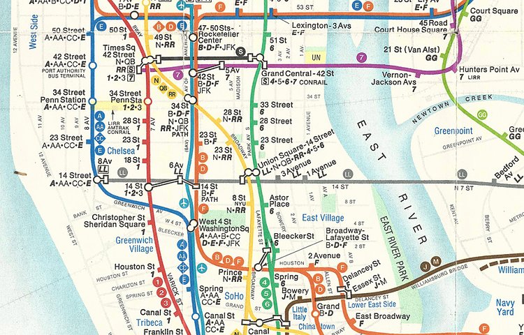


Back in 1964, the MTA decided it needed a better designed subway map and held an open competition to create the perfect map. Local lawyer R. Raleigh D’Adamo decided to submit a design and won the content with a unique design.
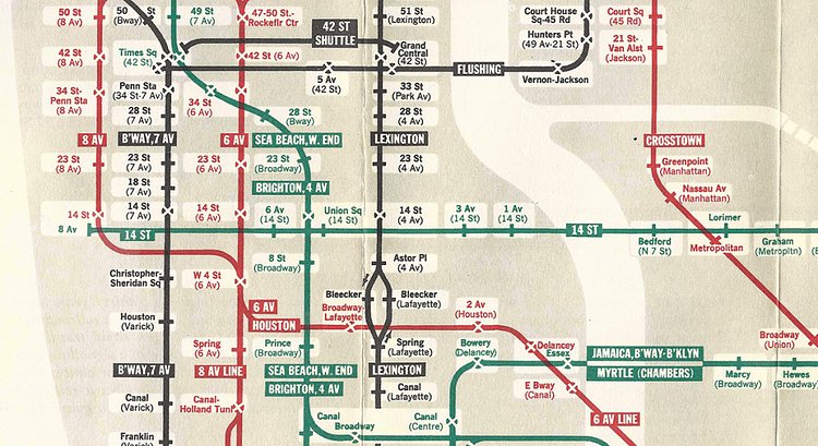
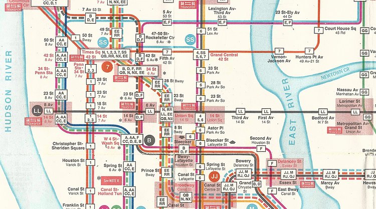
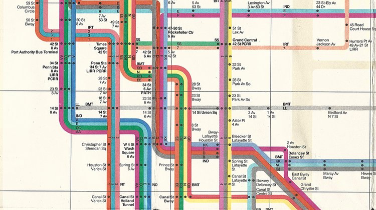
His design separated local from express routes and assigned separate colors to each of them. As retold by Peter Lloyd of TransitMapHistory.com, submissions had to fit all the subway lines into a geographically correct map. So to use as little space as possible, D'Adamo employed colored squares along shared lines. Efficient? Yes. But where the lines cluster most, the map begins to look like a Chutes and Ladders board. Plus, no station names appear on D'Adamo's map.
The map was never implemented, instead being used as inspiration for the official 1967 subway map, eventually being lost to history until D'Adamo recently found an old color photograph of the design sitting in his basement.
Digitally restored by designer Reka Komoli, the map is now available to inspire all future MTA map designers with its simplicity and space-saving feature of in conveying express vs local lines with a checkerboard pattern.
It's cool to find old stuff like this, but we are still in favor of the beautiful and geometric Moilanen Map.

Matt Coneybeare
Editor in Chief
Matt enjoys exploring the City's with his partner and son. He is an avid marathon runner, and spends most of his time eating, running, and working on cool stuff.
Something wrong with this post? Let us know!


