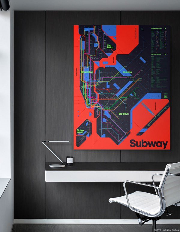
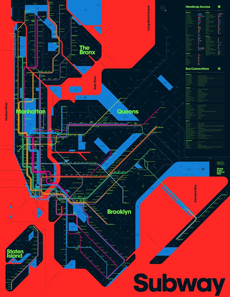
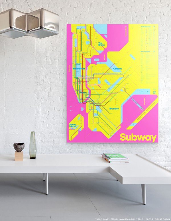
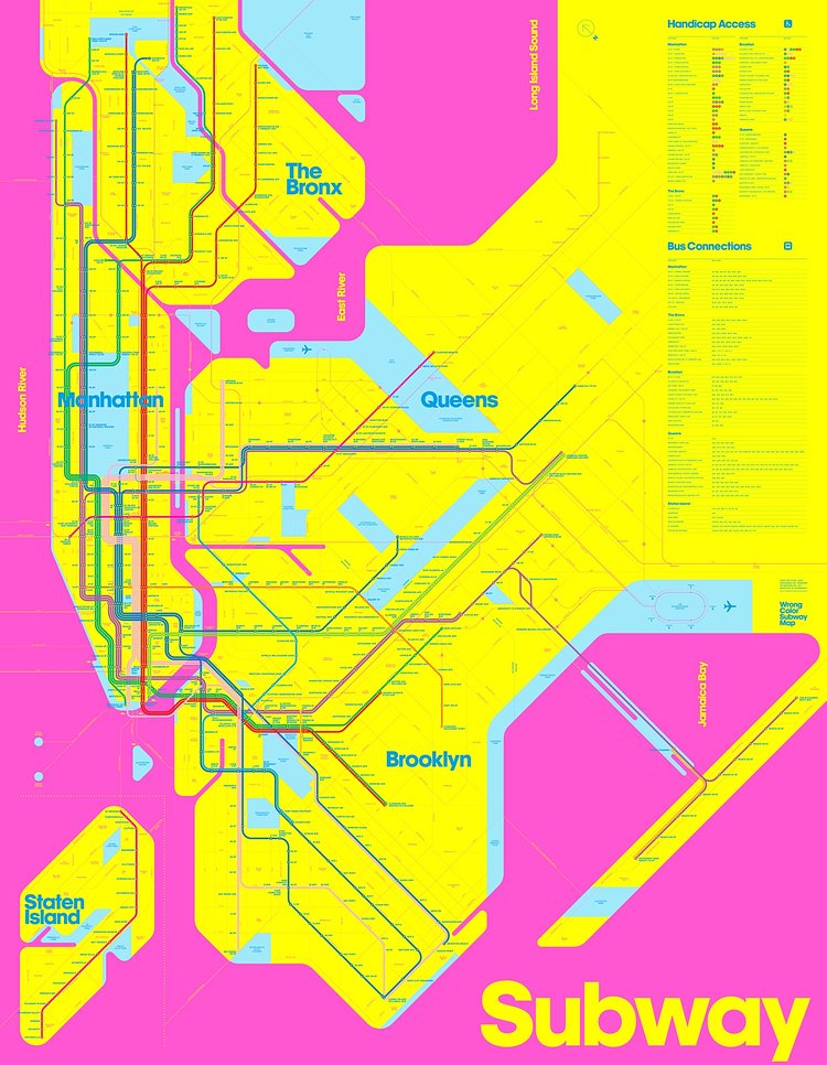


The Wrong Color Subway Map is a new take on the New York City subway map that we know and love, but with a color scheme which is well-designed, but "wrong" in that it doesn't correspond to any of the lines or typical topographical colorization schemes.
The maps were designed by David Heasty and Stefanie Weigler, a husband and wife team behind design firm Triboro.
Upon moving to NYC in the early 2000s, the pair found their design sensibilities offended by the dull colors of the city’s subway maps–especially when compared with those of cities like London, where underground transit maps were so aesthetically pleasing they could double as wall art. Heasty and Weigler found the MTA subway map to be not only unattractive but confusing, without enough visual hierarchy for visitors to quickly orient themselves.
Check out the project page to learn more about the maps and design process, or to buy prints.


via 6sqft

Matt Coneybeare
Editor in Chief
Matt enjoys exploring the City's with his partner and son. He is an avid marathon runner, and spends most of his time eating, running, and working on cool stuff.
Something wrong with this post? Let us know!


