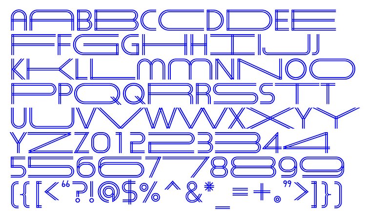
New York designer Natasha Jen recently created this sweet fontface called Herita-Geo, inspired by and designed for the NYC Heritage Ball, that includes letters and numbers that expand and contract in order to auto justify the line length in a cool animated way.
Expanding and contracting, the typography visually echoes the way buildings and structures adapt to fill available area, especially in cities and urban environments.
Check out the design page to learn more about the fontface and the design approaches behind it.


via Laughing Squid

Matt Coneybeare
Editor in Chief
Matt enjoys exploring the City's with his partner and son. He is an avid marathon runner, and spends most of his time eating, running, and working on cool stuff.
Something wrong with this post? Let us know!

