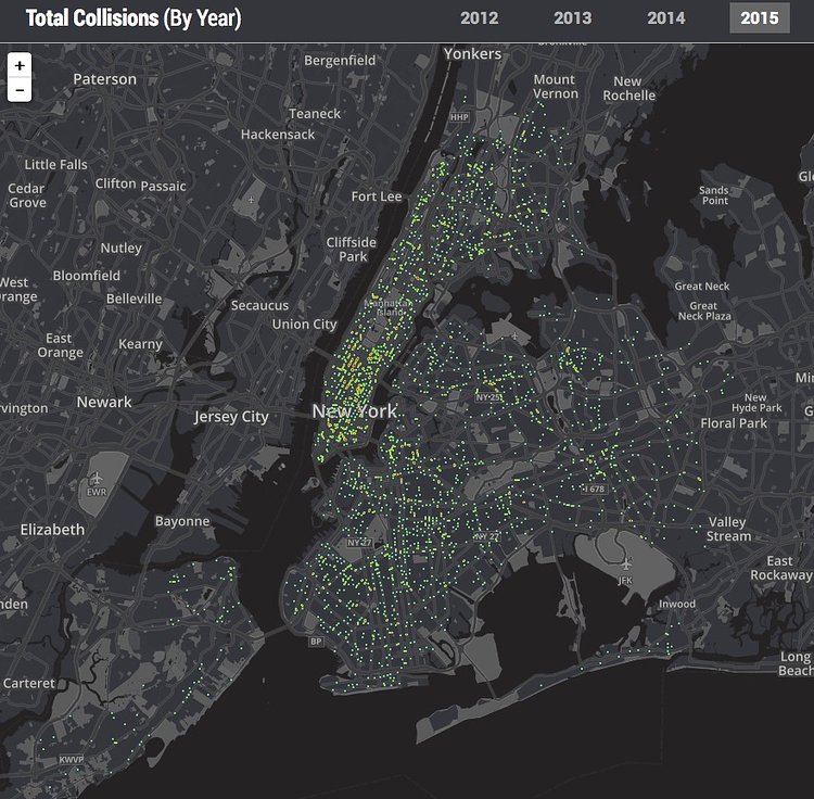
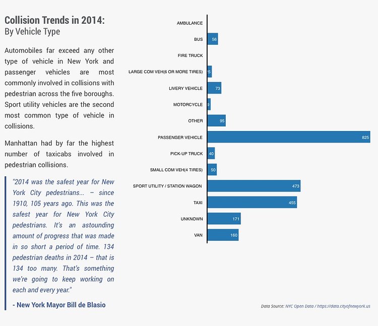


WalkSaferNYC is a new interactive site from legal firm Hecht Kleeger & Damashek that includes maps and data visualizations of pedestrian-related traffic incidents in the City.
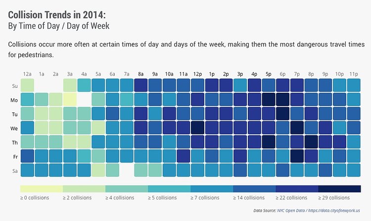
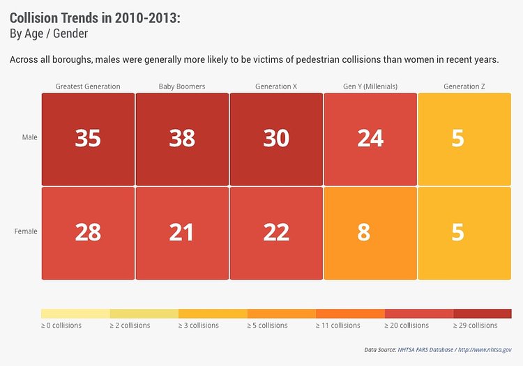
By analyzing and visualizing City datasets, HK&D was able to detect some of the most dangerous intersections for pedestrians to walk through, broken down by borough, as well as provide helpful analysis for the best and worse times to be a pedestrian in those areas and more.
We asked the team behind the site a few questions about the project.
Why did you create these infographics?
The purpose of the map creation is to raise awareness for the most dangerous intersections in New York City. With the recent speed limit reduction, the map was created with the intentions to assist with promoting safety.
What are you hoping to achieve by releasing them?
The map was designed to help NYC pedestrians, motorists, and tourists to make more informed decisions regarding areas and intersections that could potentially be dangerous for them. HKG saw that pedestrian safety needed to become a more widely-exposed issue for NYC, hence the creation of the safety map for all to use.
Based on what you have seen, do you think the City is doing a good job at keeping pedestrians safer than in the past?
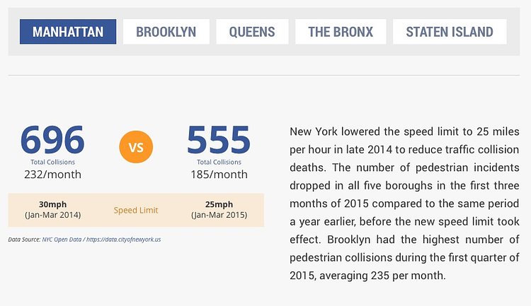
With the recent speed limit reduction, the number of accidents in the city has declined substantially, as outlined in the WalkSaferNYC map. Motorists are being forced to slow down, and with the use of the WalkSaferNYC map, hopefully pedestrians will make more informed choices when choosing which intersections to cross.
Check out WalkSaferNYC for more pedestrian safety stats and visualizations for your neighborhood.
Submitted via Viewing NYC Tips
Something wrong with this post? Let us know!


