Local photographer and cartographer Andrew Lynch runs an interesting blog called Vanshnookenraggen in which he combines his love for the City, transportation, and maps to write great data-based articles on the City's subway system.
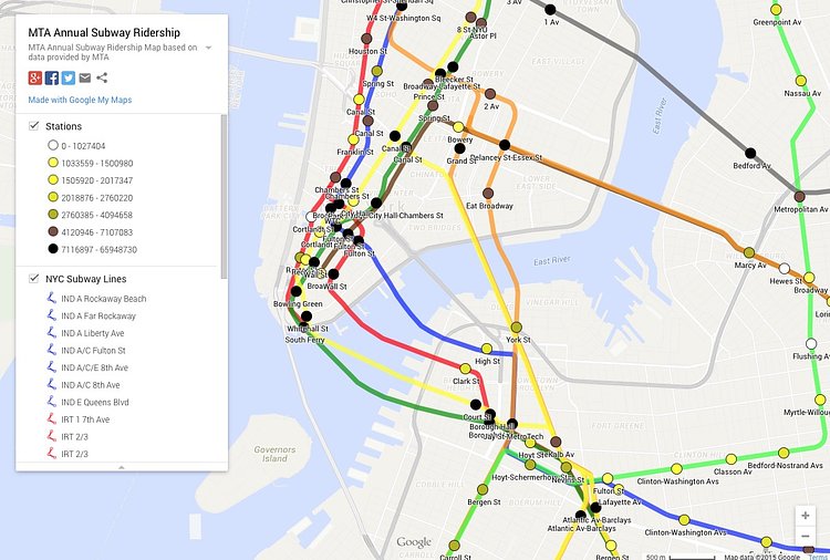
In a recent article titled NYC Subway Ridership Visualized, Lynch took MTA ridership data and mapped them out by station, with color coding for easy viewing. The darker the dot, the higher the ridership that station has.
How busy is your station?

Matt Coneybeare
Editor in Chief
Matt enjoys exploring the City's with his partner and son. He is an avid marathon runner, and spends most of his time eating, running, and working on cool stuff.
Something wrong with this post? Let us know!


