Photo:
Imgur
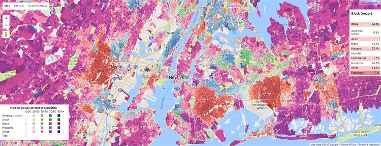
These colorful maps of New York City and its five boroughs show ethnic/race density per zip code based on the most recent U.S. census data. They were originally generated from the excellent Justice Map, an online tool that helps "visualize race and income data for your community, county, and country." Check out the breakdown for your borough below.
Brooklyn
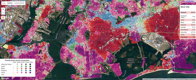
Photo:
Imgur
Queens
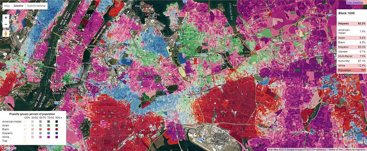
Photo:
Imgur
Manhattan
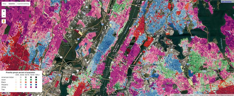
Photo:
Imgur
The Bronx
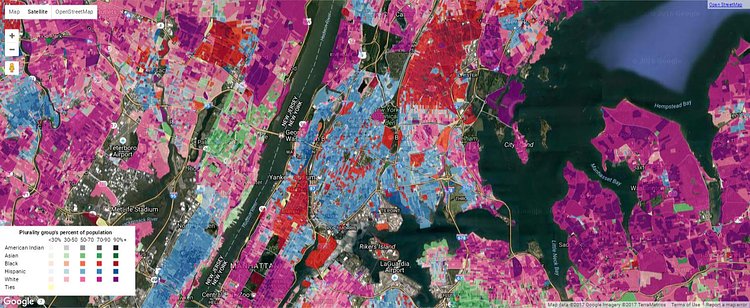
Photo:
Imgur
Staten Island
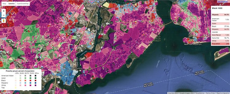
Photo:
Imgur
h/t reddit

Matt Coneybeare
Editor in Chief
Matt enjoys exploring the City's with his partner and son. He is an avid marathon runner, and spends most of his time eating, running, and working on cool stuff.
Something wrong with this post? Let us know!


