Alasdair Rae is a senior lecturer and researcher at the University of Sheffield in the U.K. In
his spare time, he runs a neat little blog called Under the Raedar where he performs
data analysis on a wide range of topics in order to present them in easy to understand infographics and maps.
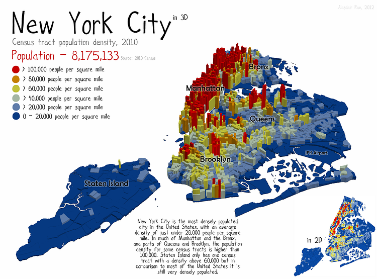
In this map, Alasdair takes the 2010 census data for NYC Population and makes a 3D graphic showing the areas of the city where most
of it's 8 million occupants reside. While Manhattan is the most dense borough overall,
Corona, Queens actually has the most dense neighborhood,
with 216,000 residents per square mile.
via Under the Raedar
Something wrong with this post? Let us know!


