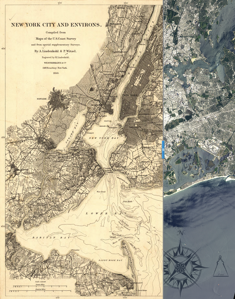
The Landsat Science team at N.A.S.A. recently combined a vintage map of New York City from 1860 with a satellite image of the City from 2013, allowing you to compare and contrast with a flick of the blue slider.
Comparing the 1860 map with the Landsat scene, clearly the general configuration of the area has not changed in 165 years, but wharfs and other structures have been added along the Hudson River, Newark Bay and elsewhere. Urban areas have expanded dramatically, exemplified by the cities of Newark and Elizabeth in New Jersey. The two cities appear as darkened areas on the left side of the 1860 map (Newark larger than Elizabeth), and in the Landsat scene they are represented by light gray colors that show an almost unbroken area of urbanization. Brown colors in the Hudson River show sediment being carried to New York Bay. Green areas indicate open spaces and small forests.
Check out the full article to play with the image, and to read more analysis about what has happened over the past 150 years.
via N.A.S.A.

Matt Coneybeare
Editor in Chief
Matt enjoys exploring the City's with his partner and son. He is an avid marathon runner, and spends most of his time eating, running, and working on cool stuff.
Something wrong with this post? Let us know!


