
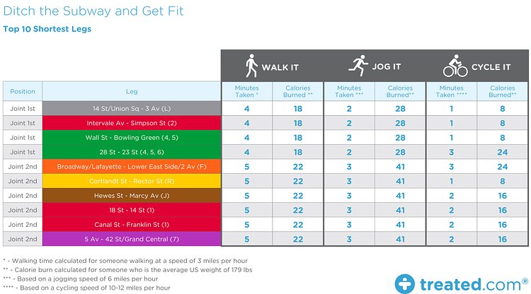
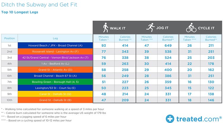


Online healthcare provider Treated recently published this great analysis on subway commuting in New York, and how you can be healthier by walking, jogging or biking a few stops instead of taking the train.
Relying on public transit is a part of everyday life for many living in New York. And, thankfully, unlike London, there appear to be no current disputes or plans for strike action on the New York transport network at time of writing. Nonetheless, we wanted to highlight the potential advantages of switching up sections of your commute, and opting to walk, jog, or even cycle instead. So we got to work and put together the following: a comprehensive map of the New York Subway system, with calorie burn information for each individual part of the network.
The large subway map shows how many calories an average human will burn walking between stops instead of riding the train. They then went one step further and computed the calories burned to walk, jog and bike the 10 shortest and 10 longest distances between two stations.
Read through the full article for more results and info on methodology.