Location Data From Tweets Create Accurate Interactive Map Showing Local Spots vs Tourist Spots

Data visualization artist Eric Fischer has created some fantastic maps of human trends based on millions of tweets. He analyzed the tweets with location data for where they were posted, then looked at the posting history for each account. If you had been posting in one region for longer than a month, you were categorized as a local, other wise as a tourist.

When mapping out each tweet's location using red dots from tourist and blue ones for locals, Fischer was able to discern the hot spots for tourist in a heat map fashion. We all know where the tourists flock and where to avoid, so a more interesting feature in the interactive map is to look at the hot spots for locals. What streets are the hottest in each neighborhood, or what areas are "dead zones" with not a lot of things going on?

Check out the full interactive map for New York City, then also check out some of the other World cities analyzed afterwards.

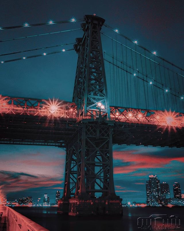
[VIDEO] Incredible Vintage Film Shows the Opening of the Williamsburg Bridge in 1903

This fantastic video from over a century ago shows the grand opening of the Williamsburg Bridge on December 19th, 1903. It was restored and uploaded by YouTuber and historian Guy Jones.

Early film of the opening of the Williamsburg Bridge with the mayor Seth Low in NYC on Dec. 19, 1903. Cool view of bulky early cameras at 2:00. Added in sound ambience to compliment the visuals. This film was shot by G.W. "Billy" Bitzer.

The sound isn't original but adds a pleasant ambiance and realism to the scene.