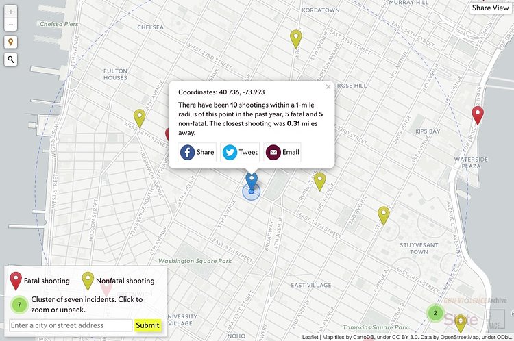
A recent article and interactive map on The Trace talks about gun violence in America, and provides a scary tool to show you how many people have been shot near you this past year.
Thanks to a nonprofit, nonpartisan project known as the Gun Violence Archive, data on gun homicides and non-fatal shootings is now available well before the federal government releases its statistics. That data includes location information that makes it possible to plot those shootings on a map showing how many have taken place in your vicinity. Where someone was killed, the shooting is coded in red (this includes multiple victim incidents with a mix of fatalities and injuries). Shootings resulting in injuries but not deaths are coded in yellow.
Check out the map and accompanying article to see how many shootings there have been in your neighborhood.
via The Trace

Matt Coneybeare
Editor in Chief
Matt enjoys exploring the City's with his partner and son. He is an avid marathon runner, and spends most of his time eating, running, and working on cool stuff.
Something wrong with this post? Let us know!


